PowerUP is a native mobile app that helps women to build a healthier routine. I redesigned the onboarding process and the nutrition page from end to end in order to improve sign-up completion rate and member engagement.
Gain Life is a Harvard Innovation Labs startup focused on using behavioral science and technology to support employee health. We help individuals change behaviors that hold them back from the life they want. We do this using two gender-specific programs, ManUP and PowerUP, which allow plan members to select their preferred level of accountability. I participated in building the native apps (iOS and Android) starting in 2017. Then we launched the product to our customers. The app helps them lose weight and build a healthier routine.
In the summer of 2018, we encountered a high drop rate for first-time users. In order to solve the problem, we decided to redesign the app. This project contained two phases, one is the onboarding redesign, the other is the nutrition feature restructure.
I worked with Ian Richardson (product director), Abbie Kaiser (product manager), and Hannah Yee (product manager intern). I was the sole UI/UX designer.

We identified what caused a high drop rate by collecting Google Analytics data and conducting user interviews.

We held a brainstorming session to narrow down what major user problems we were going to solve.

I built quick mockups and did concept test with users to make sure we were heading the right direction.

I created a high-fi prototype and did user testing before handing over to our dev team.
The first thing we asked ourselves was ‘where did they drop off’. After checking the Google Analytics data, we saw a significant drop before users completed the onboarding process. We also contacted several current users (by email/phone) and asked about their feedback.
It turned out there were two big concerns,
1) the onboarding process is too long
2) it’s not clear how to start the nutrition program.
In order to confirm the problem, I did additional guerilla testing among Harvard faculty and staff to collect new user’s reaction. I found several friction points through that process. Then we decided to run a design sprint to solve those problems.
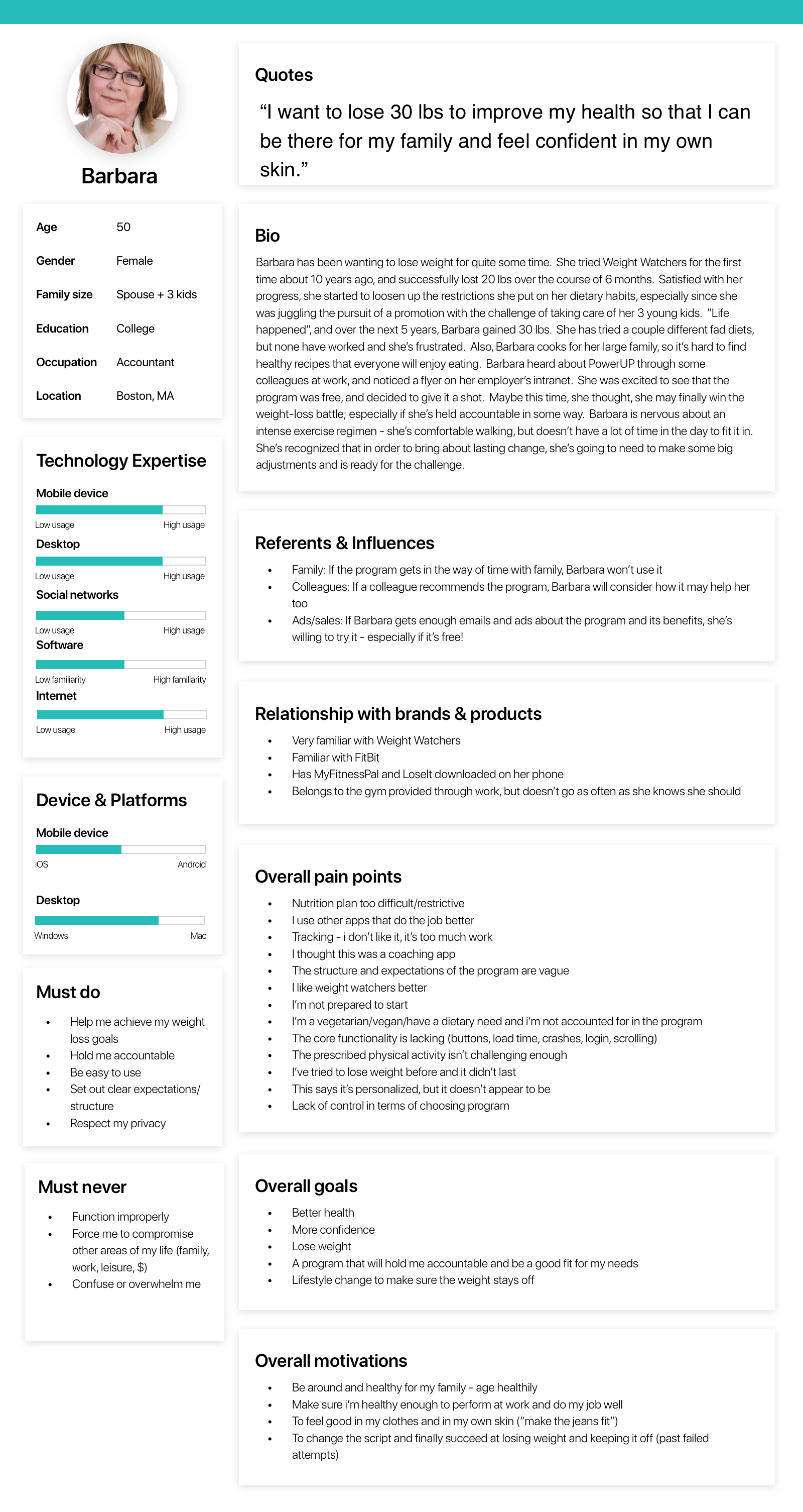
Based on our user’s demographics, we developed a persona for PowerUP.
I started with making a simple map of the product. Given the user interview data, we added user's feelings, thoughts, pain points, opportunities.
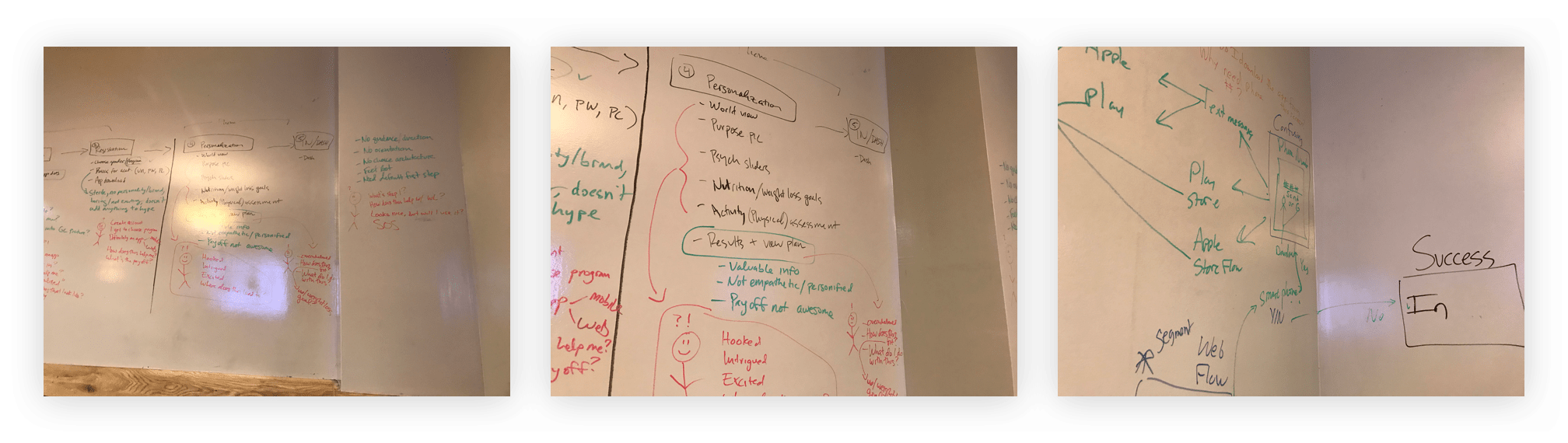
Then each of us started storyboarding separately. It turned out we had a lot of problems to solve. But we didn’t have enough time or resources to target all of them. We used the five-step "Sticky Decision" method to identify the best directions.
We decided to target two main pain points
1) onboarding confusion 2) unclear structure of our nutrition program
We used the onboarding process to help users build the right weight loss plan.The previous onboarding process was pretty long which took users around 10 minutes to finish. It included ZMET image exercise, purpose, questionnaires, mantra and motivation image setup.
We ran a quick concept evaluation before moving forward to the next step. We were not sure what kind of information users would expect after the onboarding process, whether it’s program overview, testimonial, the science behind the program, etc. So I interviewed 4 users by showing them a quick mockup.
It included three parts:
Part 1: Personalization Questions
Part 2: Personalization Results
Part 3: Navigating The App
1) Weight loss – the main benefit of our program – should be more heavily marketed throughout the personalization process. Right now, we’re hitting people over the head with mindset, worldview, purpose, wellbeing, and not tying it back to what they want – weight loss.
2) Personalization must explain the specific things we learned about the user that are relevant to their weight loss goals and the specific things that the program will do for the user as a result.
3) Users are arriving at our program with strong beliefs about what data collection would be required for personalization.
4) Users are unable to easily learn nutrition philosophy.
There were two main problems we need to solve for -- Onboarding simplification and restructuring nutrition.
We decided to cut ⅓ of the onboarding flow and only keep what is important for program personalization. Instead of collecting data that would not be used for determining program type, we removed those questions.
And for the purpose section, we only kept one question and make it easy to skip.
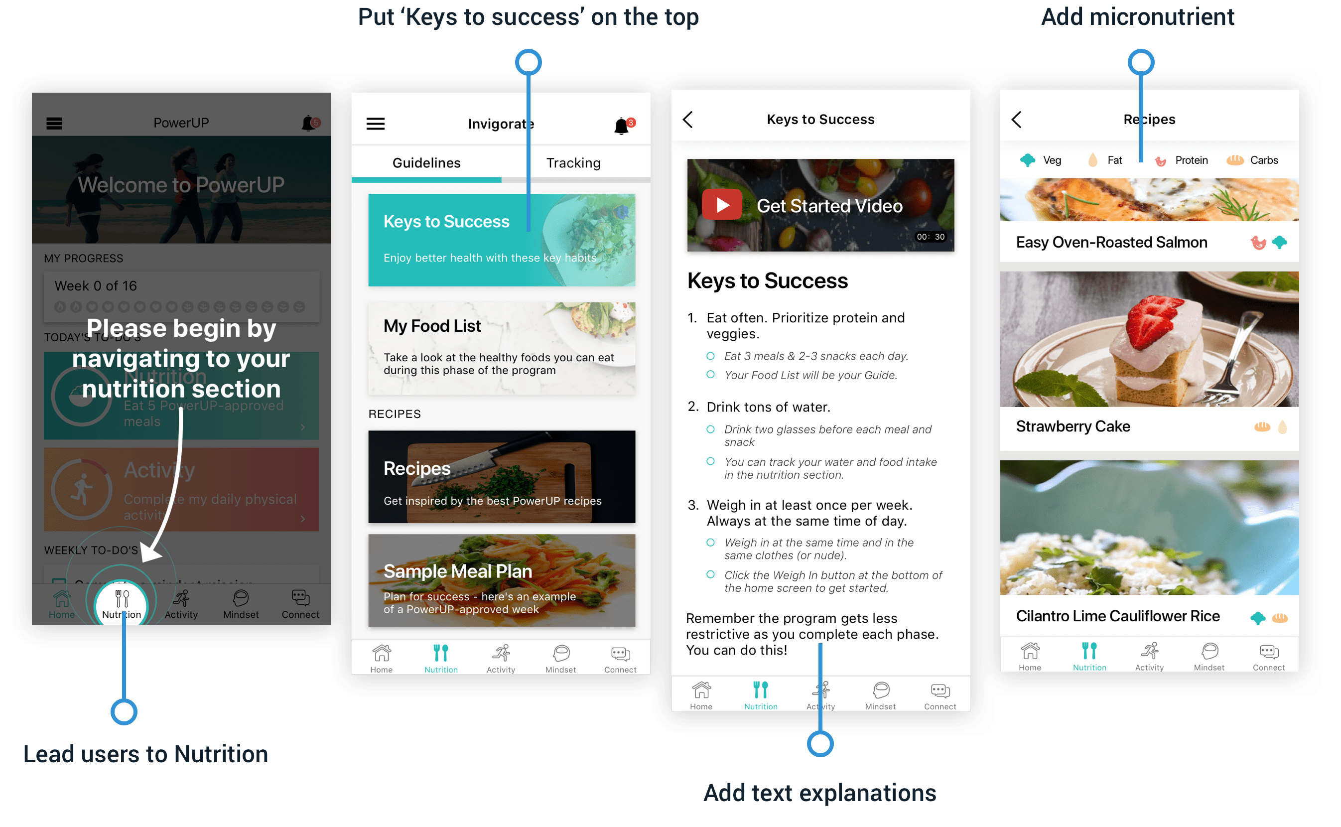
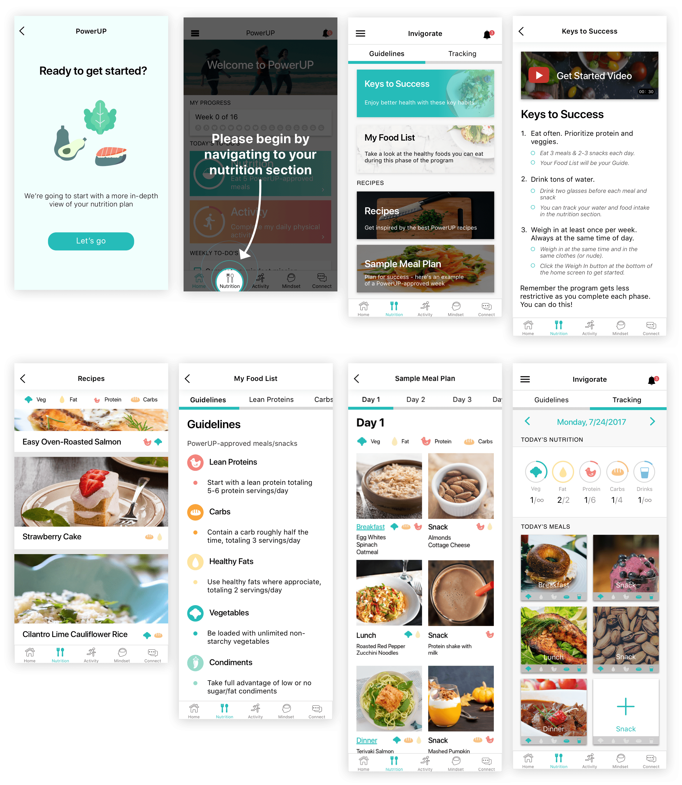
Since we’ve known that nutrition plays a significant role in the weight loss program and it’s what users want to know first. We added one splash screen to help users navigate to the nutrition feature when they first land on the home page.
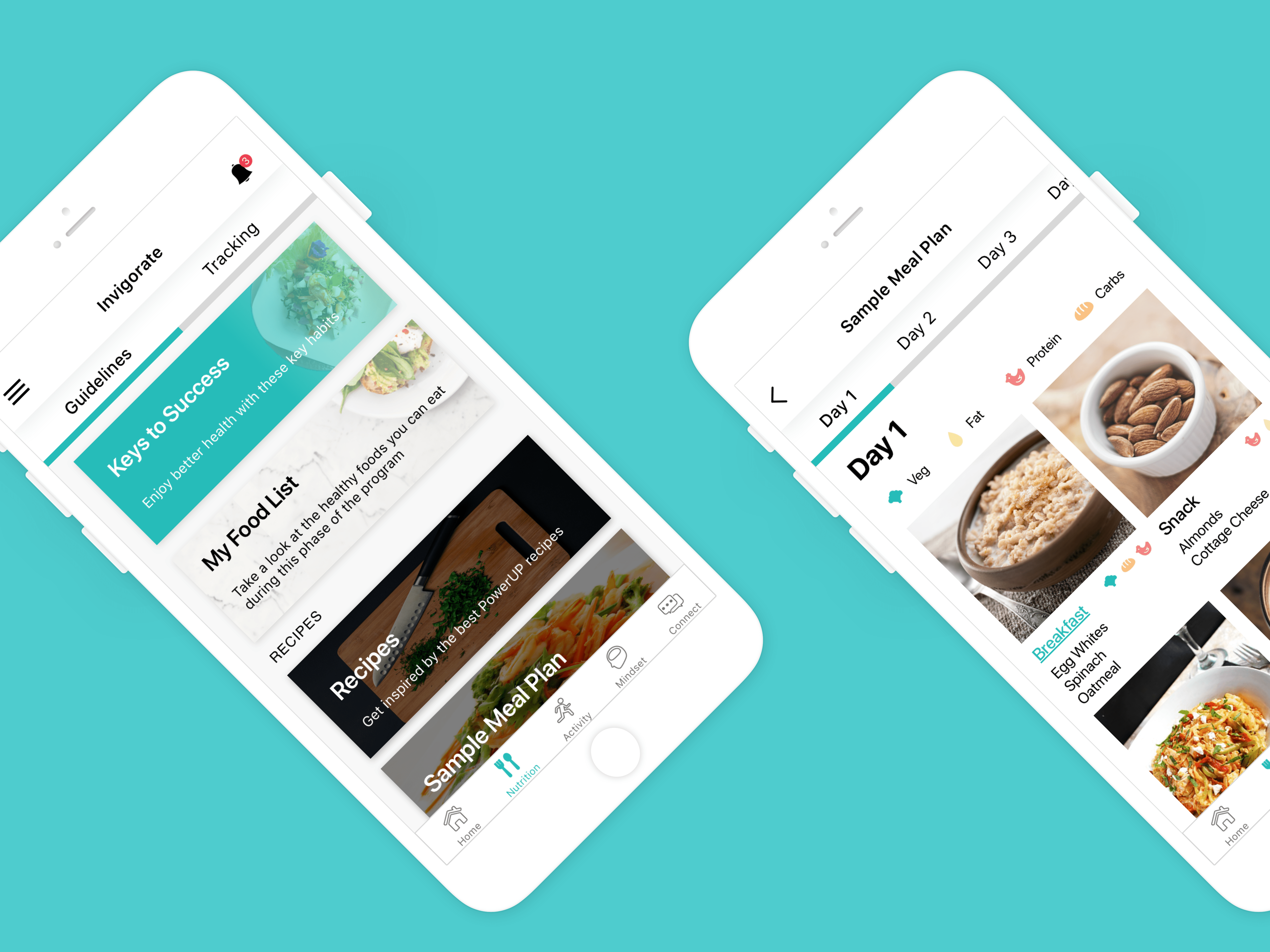
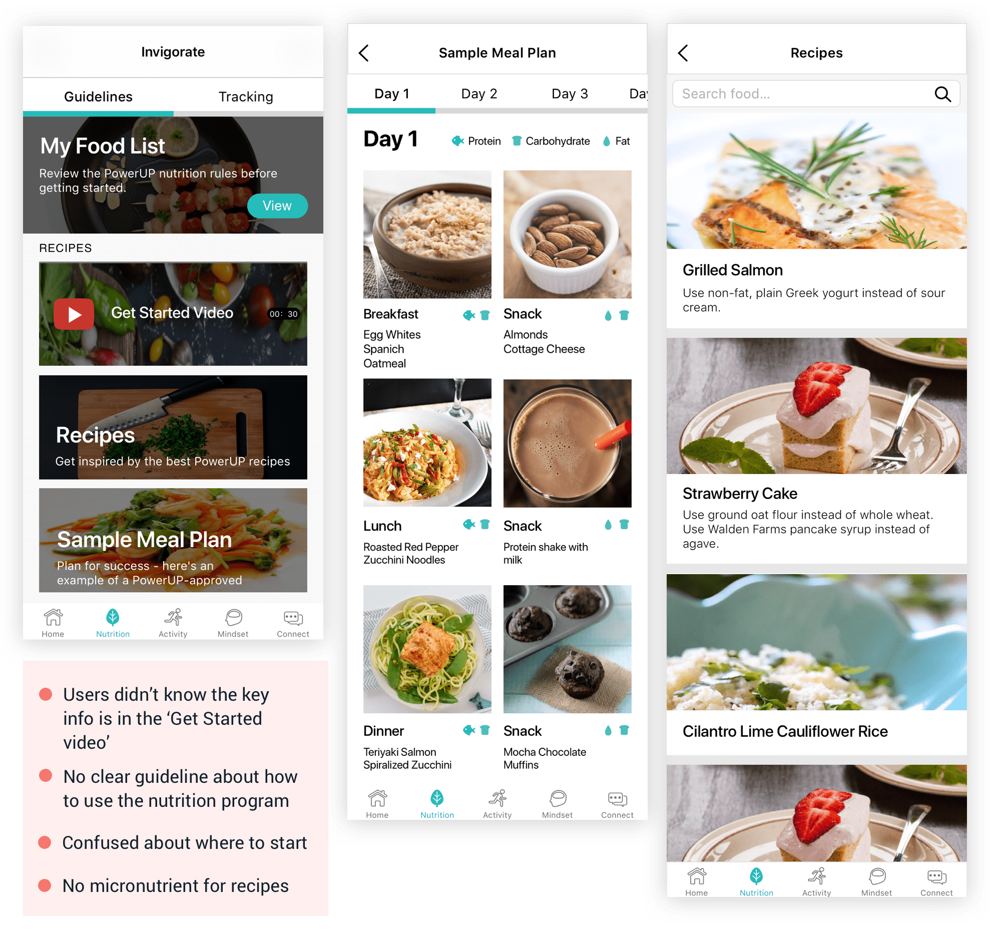
We used to have a getting started video in the previous design but it turned out people just ignored it. Sometimes because of the Internet speed, they didn’t actually watch it. So I removed it from the nutrition screen and added ‘Keys to success’ to the top of it. We hoped users click that section first where they can find how to get started.
The key to the nutrition program is not calculating calories but calculating how many servings of carbs/fat/proteins they have per day. I added different color to identify carbs, fat, veg, protein, and condiments in order to make the food list easier to read.
I also added nutrition icons to sample meal plan and recipes.
After finishing the high-fi prototyping, I tested with users and all of them landed on the ‘Keys to success’ page as desired. And the average onboarding process was less than 5 min.
After we launched the new design, it turned out the sign-up completion improved by 20%, 1-week engagement rate by over 30%, and we heard some positive feedback from current users.
I experienced the whole sprint design process within two weeks. Starting from problem identification to final design solutions, I contributed in every part of the process.
Here is what I learned:
1) Never forget testing your ideas
Sometimes designers can be biased about the design they make. It’s great to always get other people’s feedback during the design process, no matter if it's an early-stage idea or not.
2) Collaboration improves efficiency
When we ran the design sprint, I worked with 3 product team members. Because of the limited timeframe, we had to put together some ideas pretty quick and make sure it doesn’t require too much dev's work. So every time we decided to move forward with the design decision, we consulted our dev team about the developing time estimation . Understanding constraints really helped us save time.