
I led the mobile app redesign of Order History feature which supported the public company readiness. It displayed refunds, reshipments, and applied store credits that affect a customer’s order.
Time:
Oct 2021 to Nov 2021
Role:
Product Designer
Team Members:
Product Manager
Mobile Engineers
Data Analyst
QA Engineer

Grove is preparing for being a public company. We have created an API that provides the foundation to display a consistent set of pricing and order data to customers (via Charge Confirmation Emails and Order History) and Customer Happiness (via CH Plugin).
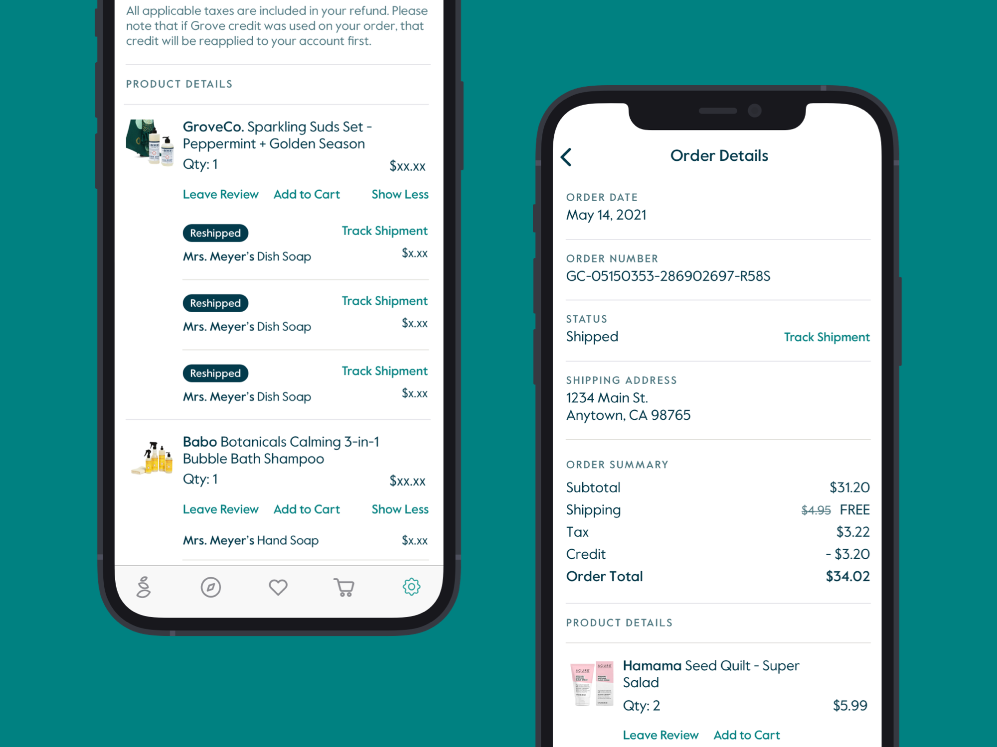
According to public company readiness, we need to display information to the customer correctly via Order History, such as store credit, refund information, and reshipped orders. But all that information was missing for the mobile app. I led the mobile app design for Order History.
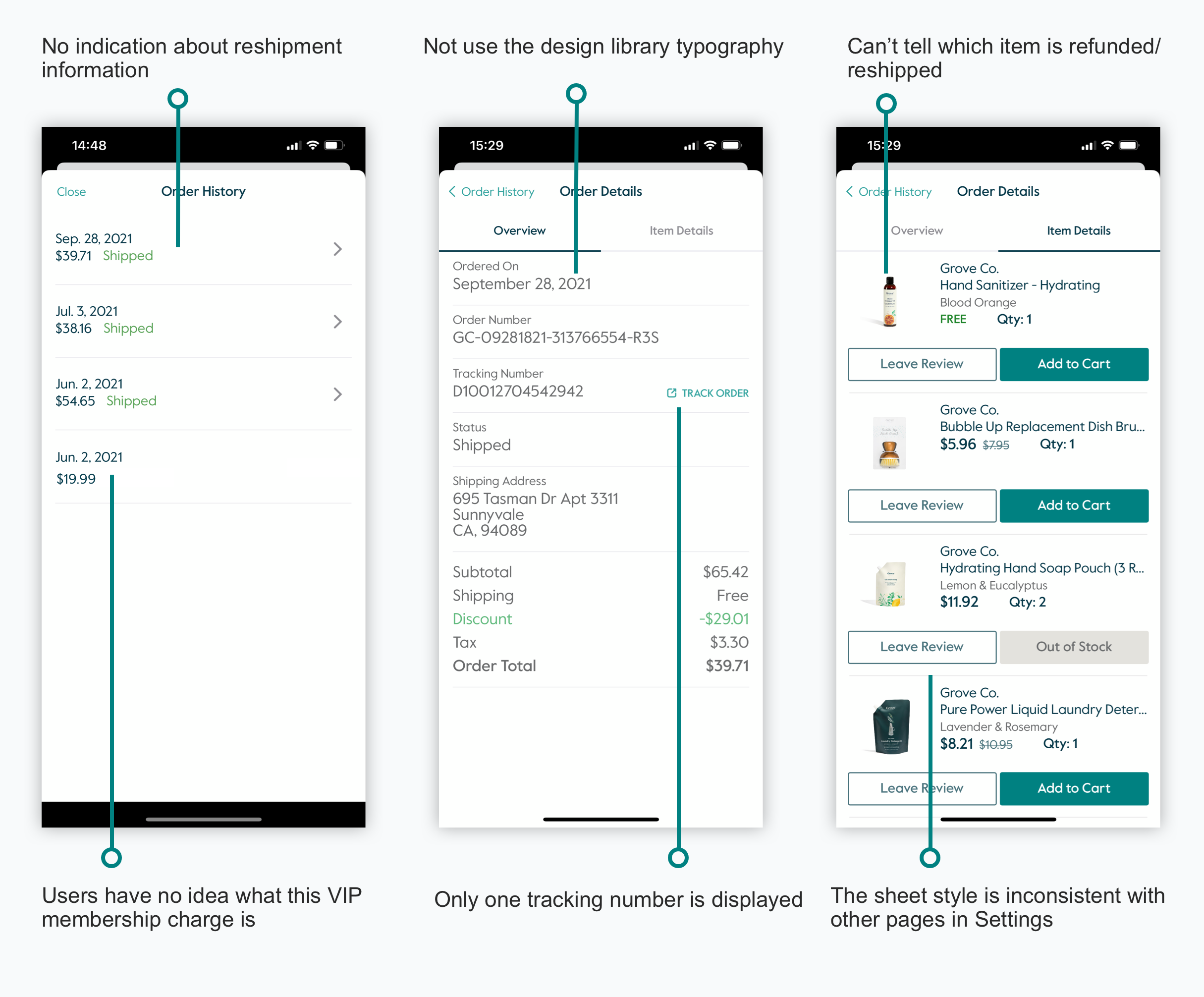
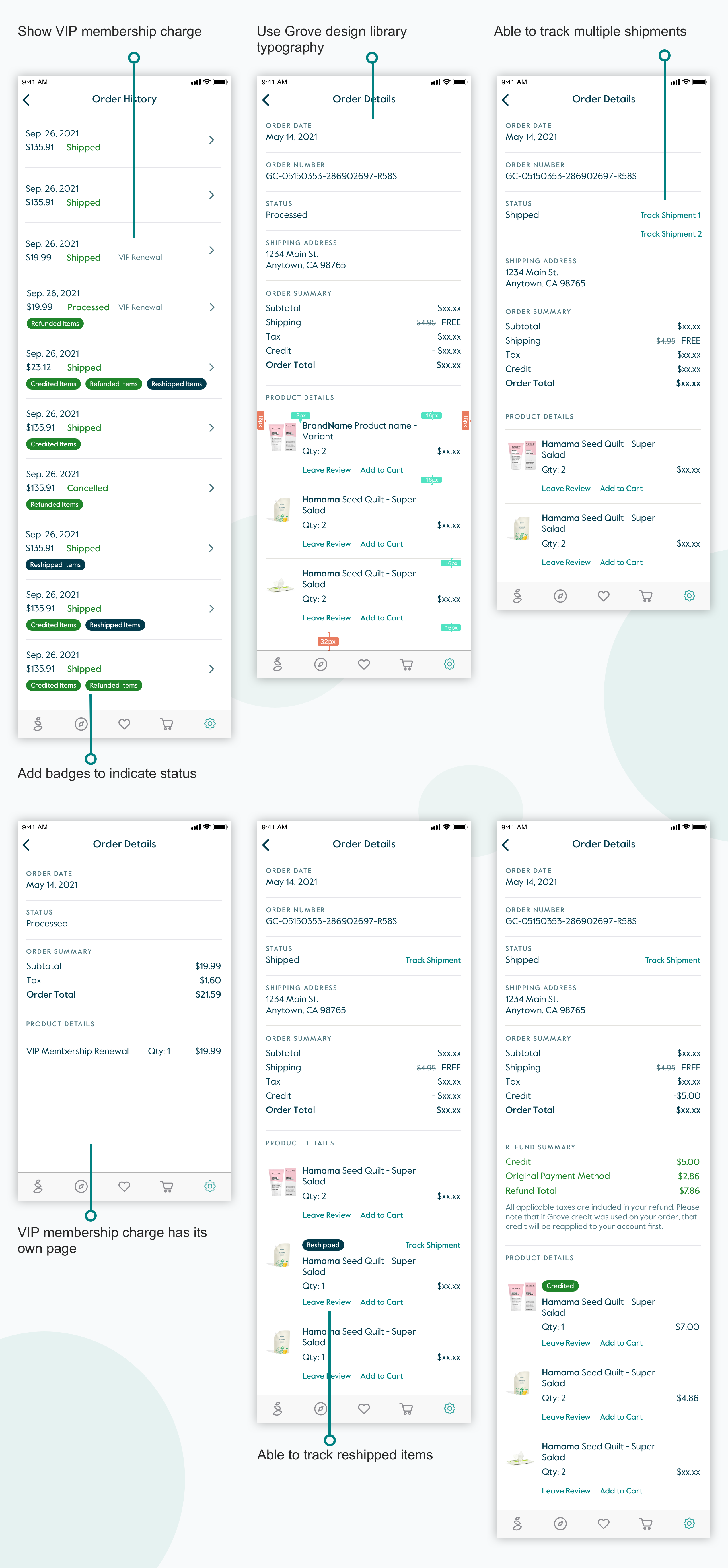
Given the guidelines from public company readiness, there were a few key parts missing for the Order History page, especially the refund and reshipment information. Customers couldn’t tell what that $19.99 VIP membership charge is about from this page and it's not clickable. Speaking of the visual style, this section didn’t use typography from Grove’s core design library.
Based on the problem analysis, I started putting together draft ideas to target all the current issues. Here are some of my initial ideas.
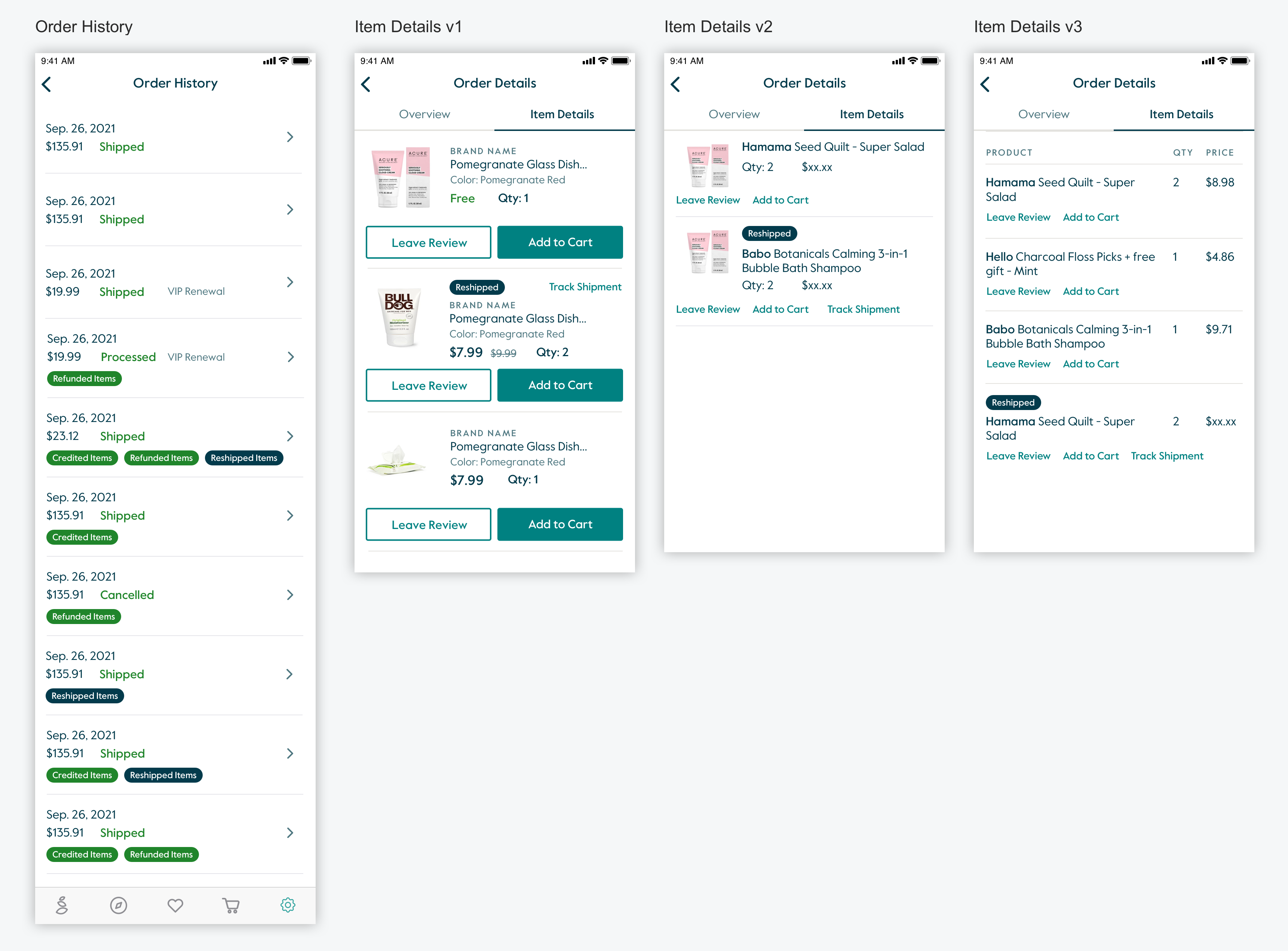
After sharing those designs internally, I realized there were two directions about how we wanted to show Item Details. One is using the existing product tiles, the other is creating new components that make the page look like a receipt.
I checked with our Data Analyst and figured out we don’t have too much add-to-cart traffic from the Order History page. So it’s unnecessary to use product tile format which takes too much space. Then I talked with the Eng team and realized they had enough resources to build new components for this page, and that wouldn't affect the launch date.
I proposed the new receipt style components and shared them internally for testing. The winner was the one without the tab and kept everything within one page.
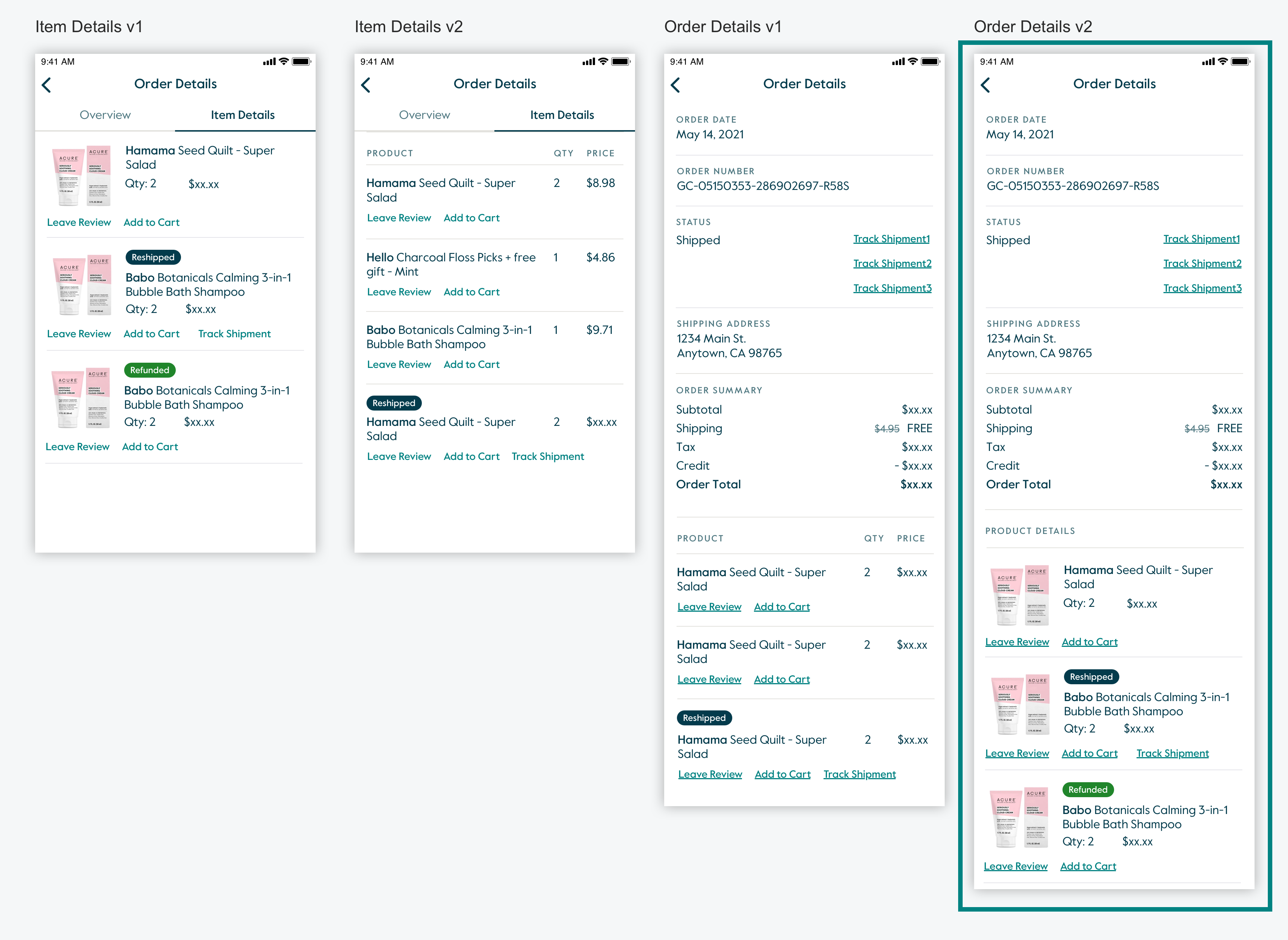
Then based on this version, I did some layout explorations for button style.
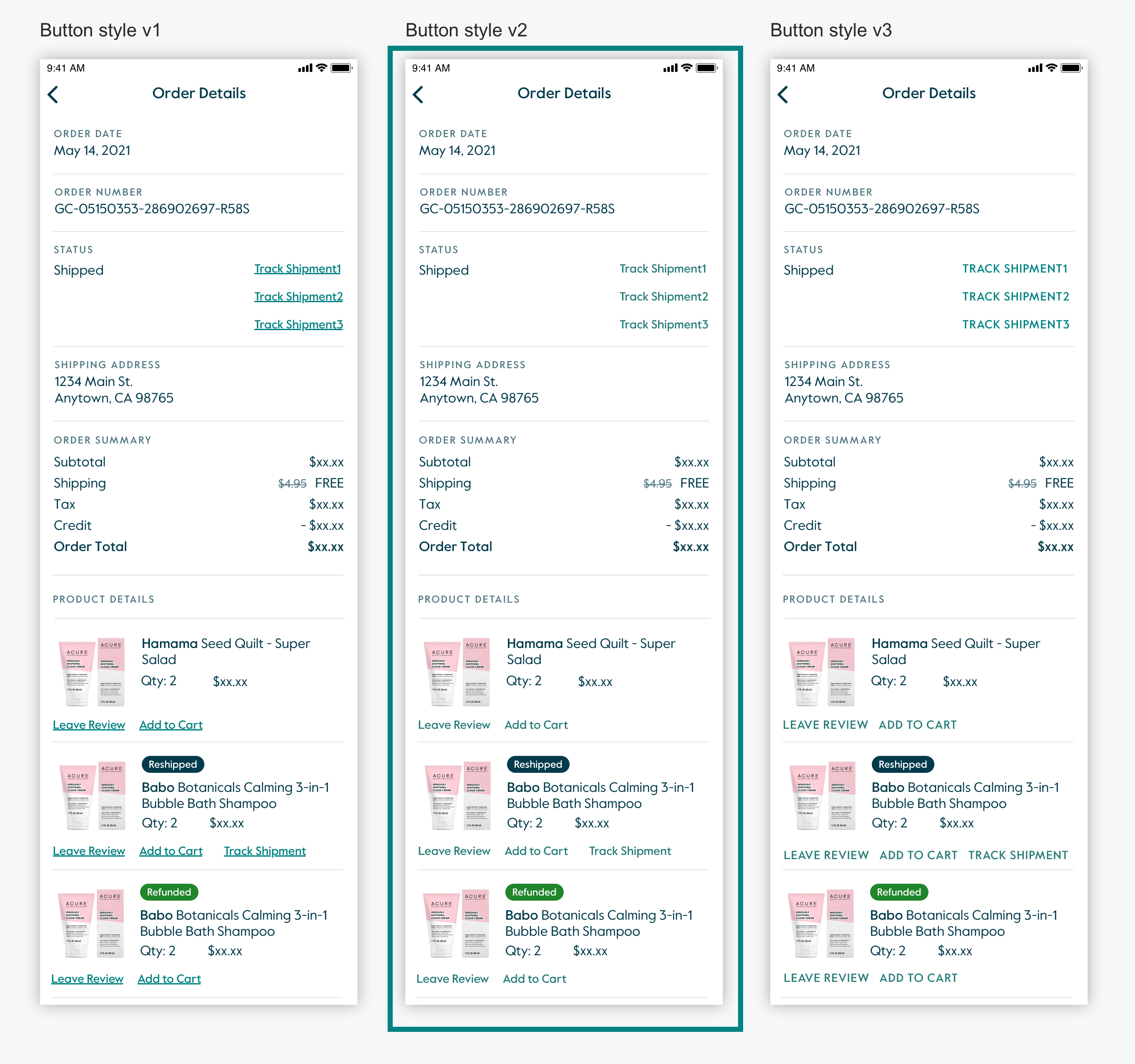
After adapting feedback from internal user testing, I took the design to the team for a final review and got approval.
Here is the comparison of Before and After Order History screens.
For this project, we had a tight timeline that required the majority of the design to be finished within one sprint. So I didn’t have enough time to test my designs with real customers. In order to validate the design, I showed those to multiple internal teams to gather feedback, since they’re also Grove customers.
I learned when making design decisions, it’s helpful to connect with Data Analyst so that I can get data to support ideations and weigh in risks. The overall risk to the business with launching the receipt view Item Details component is minimal. It's super important to keep stakeholders in the loop.
" This work was necessary in preparing Grove for some financial responsibilities of being a public company. Her work considered multiple user states and legal requirements, which she designed while still onboarding to Grove's process and structure." -- Laura
" These before and after order history comparisons are so awesome - such a big improvement." -- Alex